
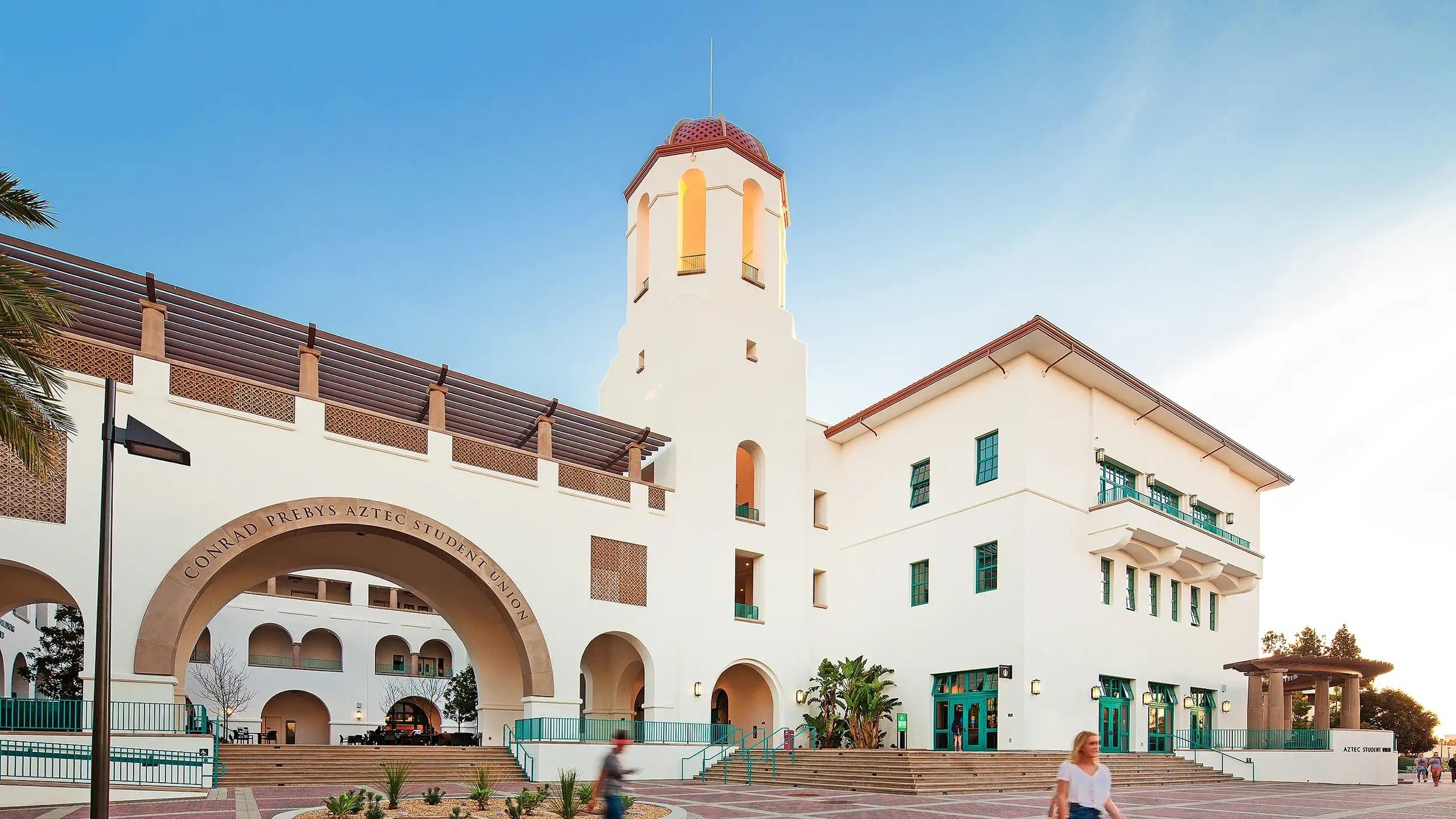
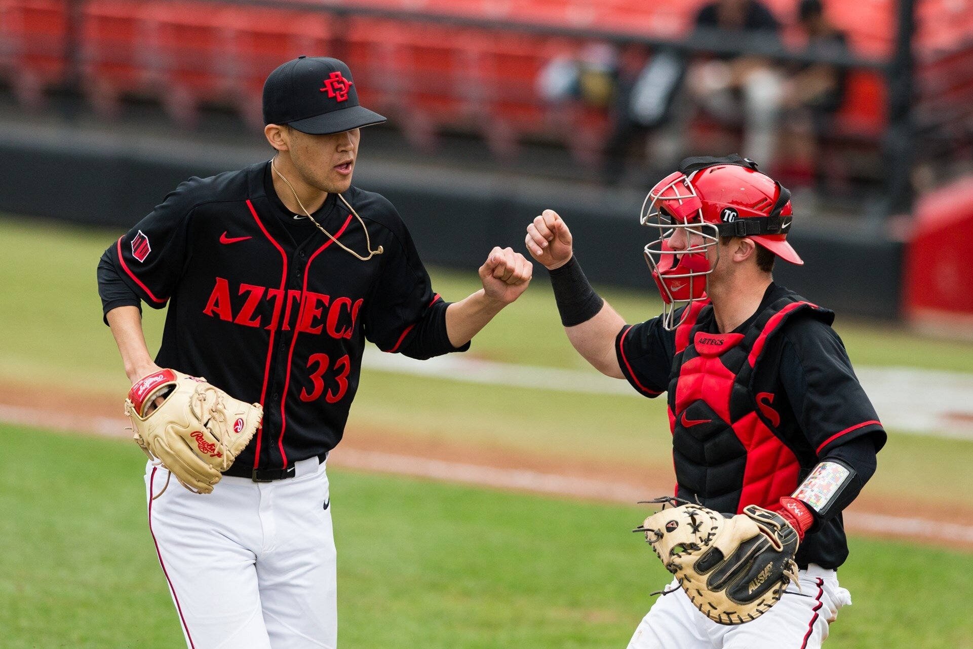
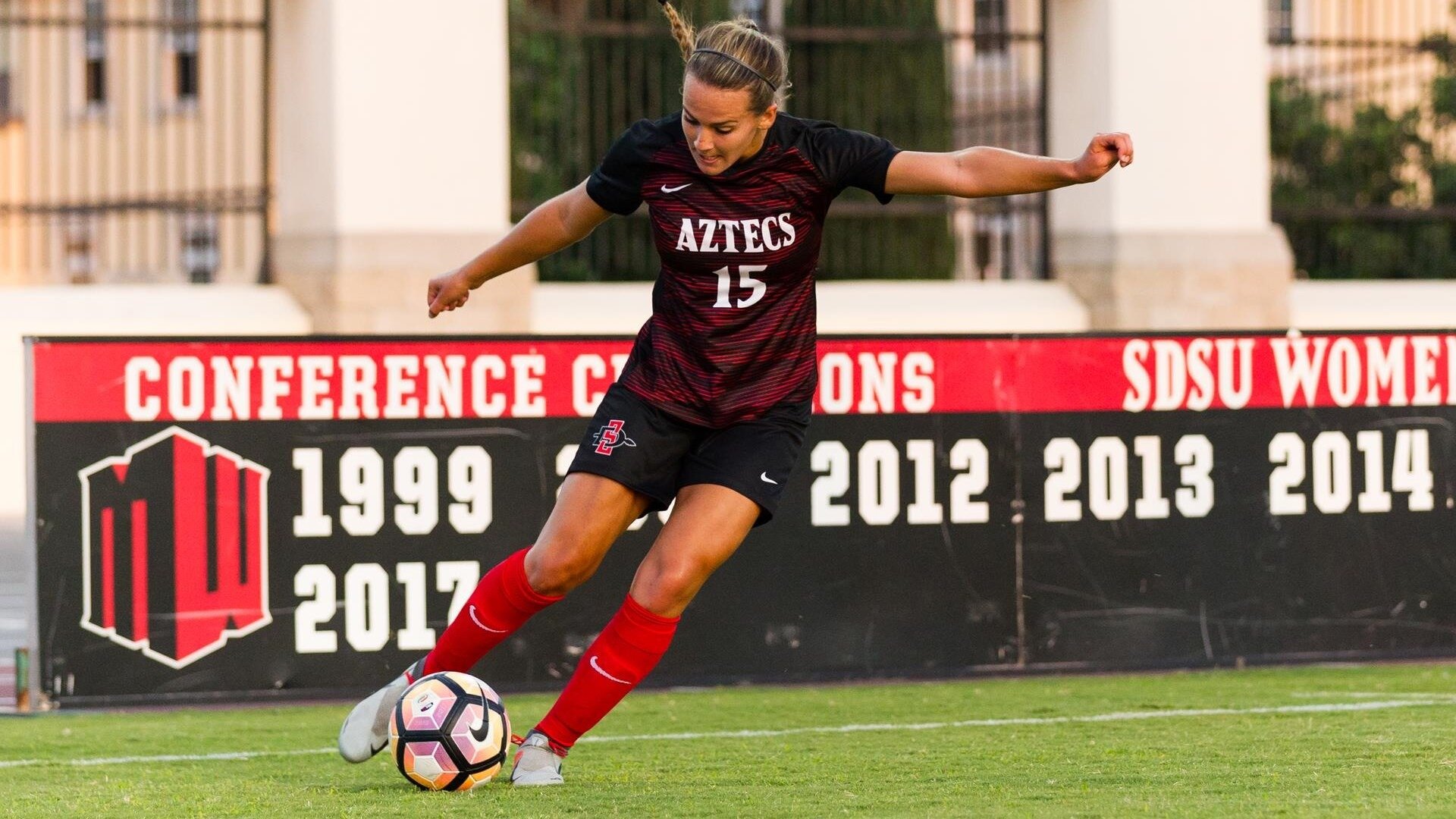
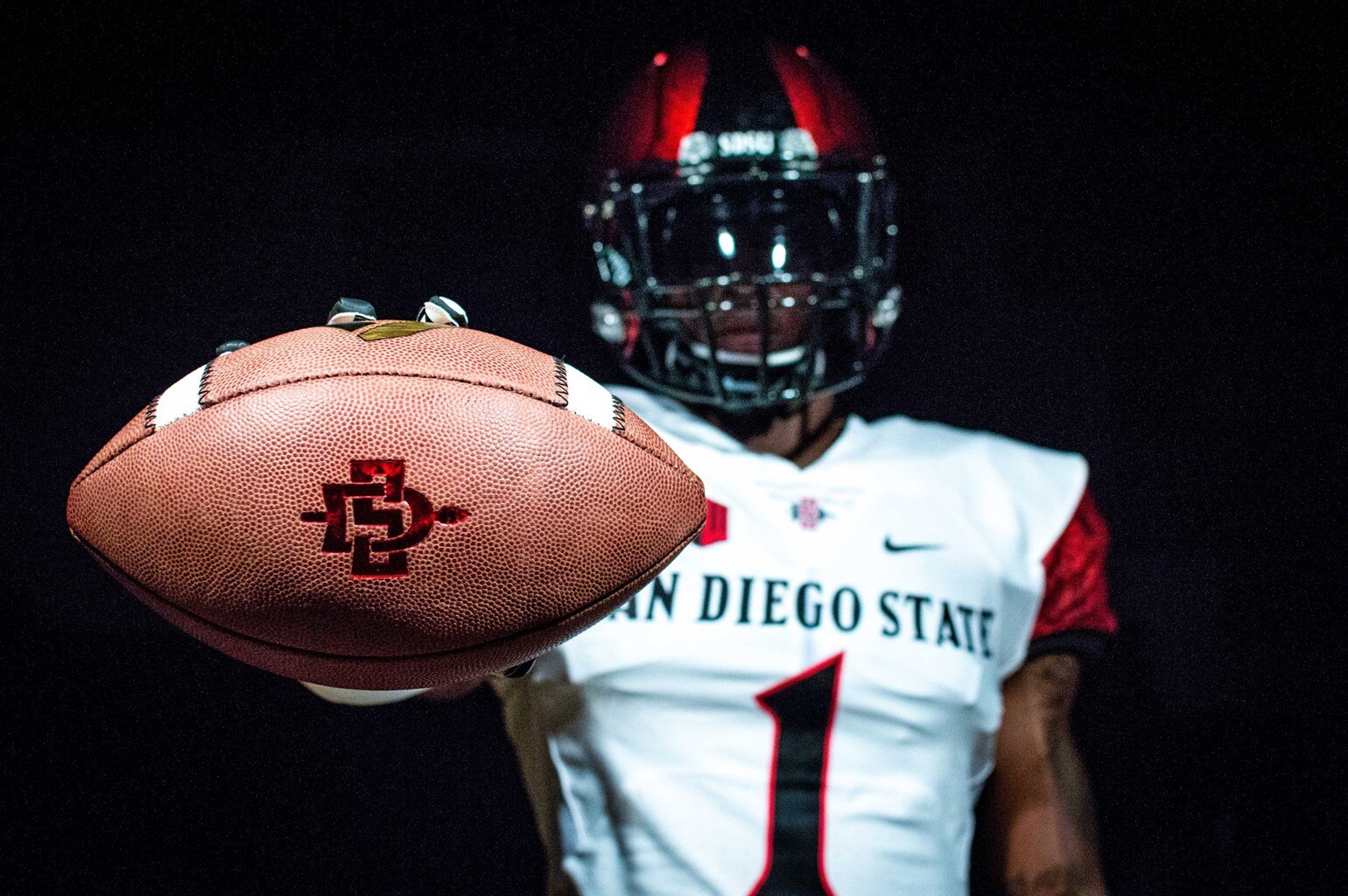
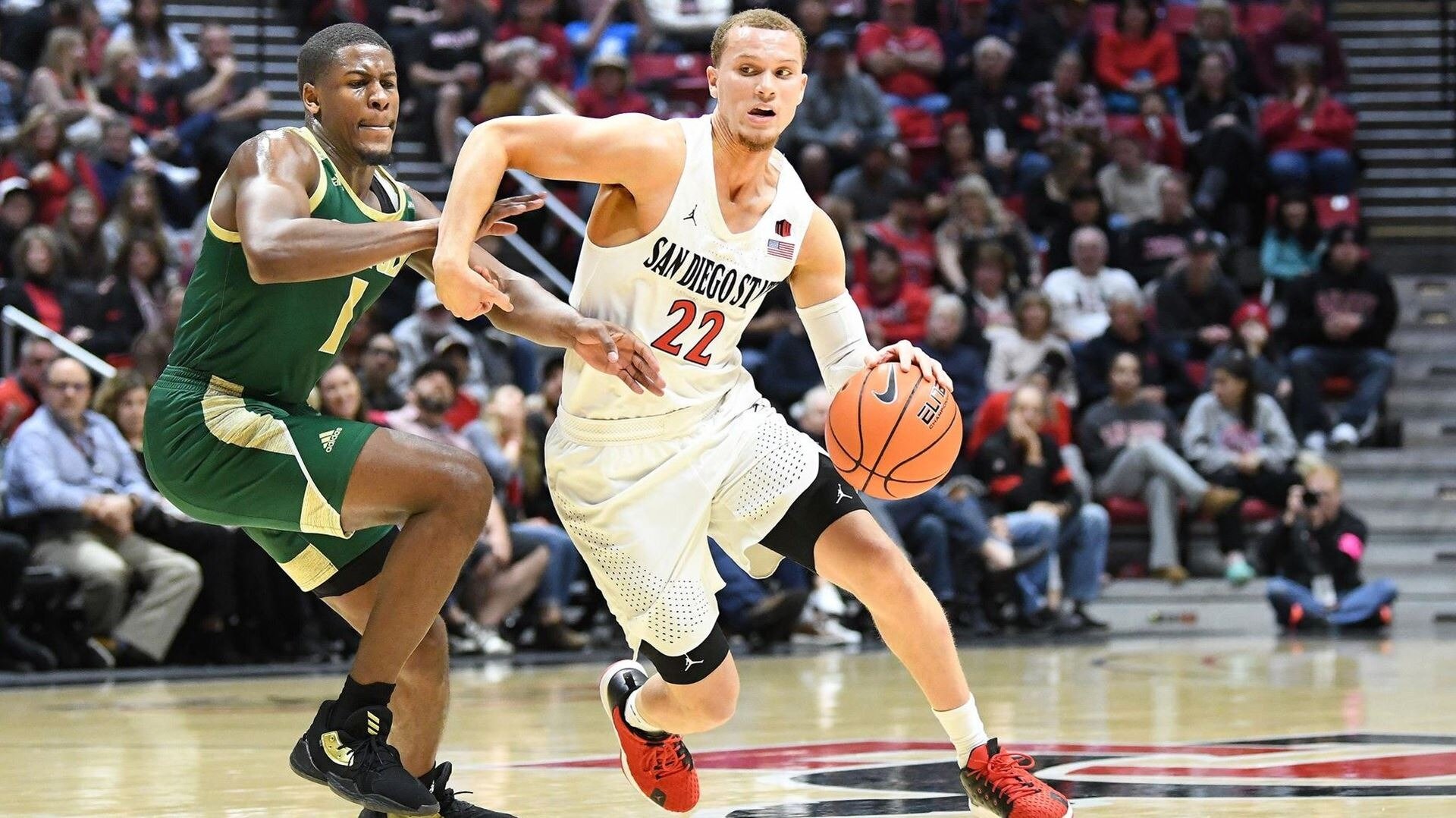
San Diego State University Aztecs
Representing a school and respecting a culture.
San Diego State University wanted to create an identity program to celebrate, honor, respect and educate, while simultaneously showcasing the Aztecs and their culture in a way that demonstrates respect for the diversity of opinion and perspectives at the University. SDSU needed a logo that not only represented the University but also respected the culture of the Aztec community.
What We Did
Market Research & Analysis
Brand Strategy
Identity & Design Development
Brand Guidelines

The Approach
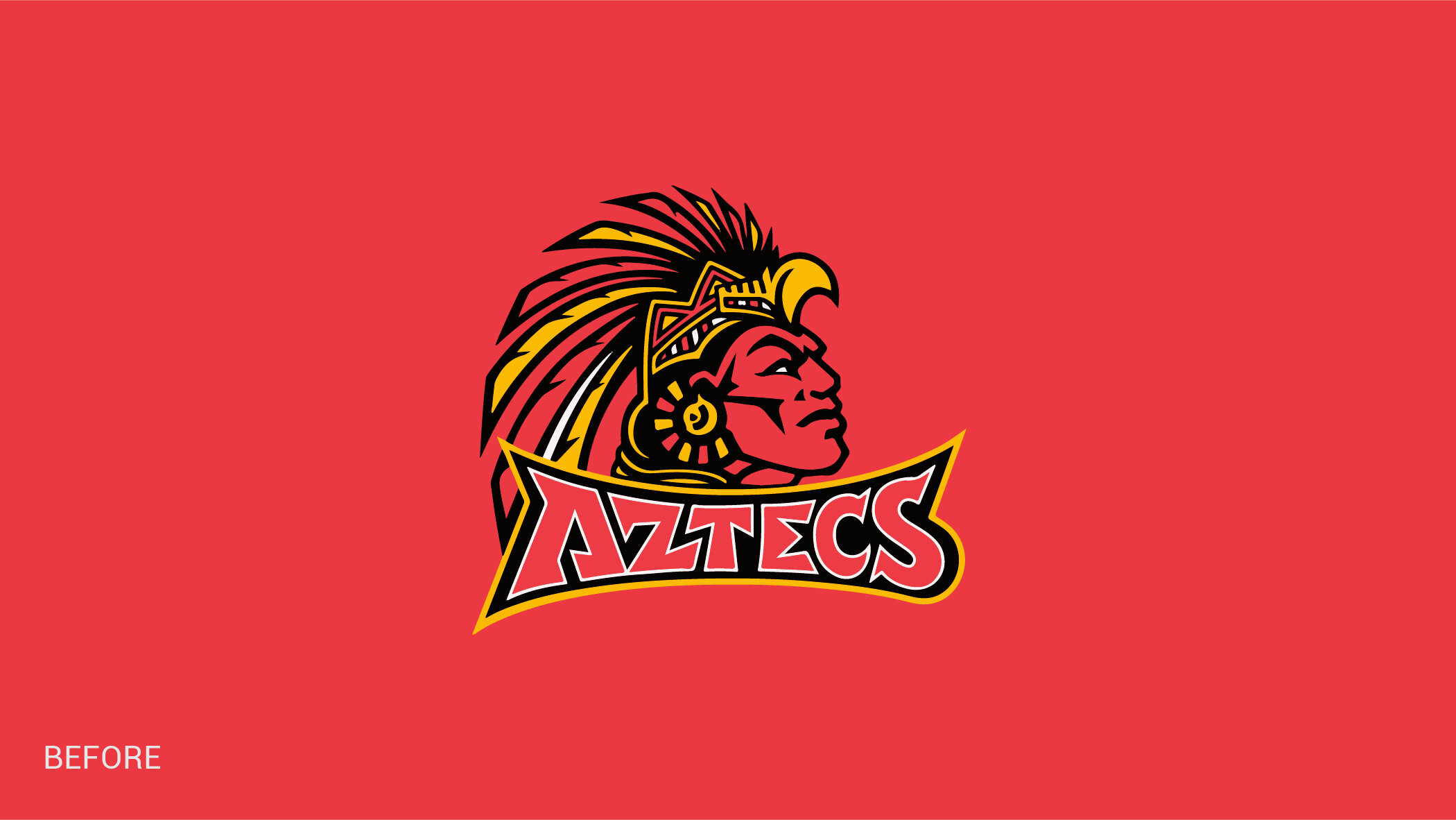
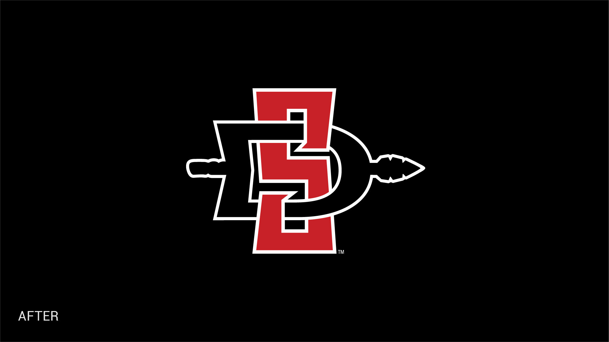
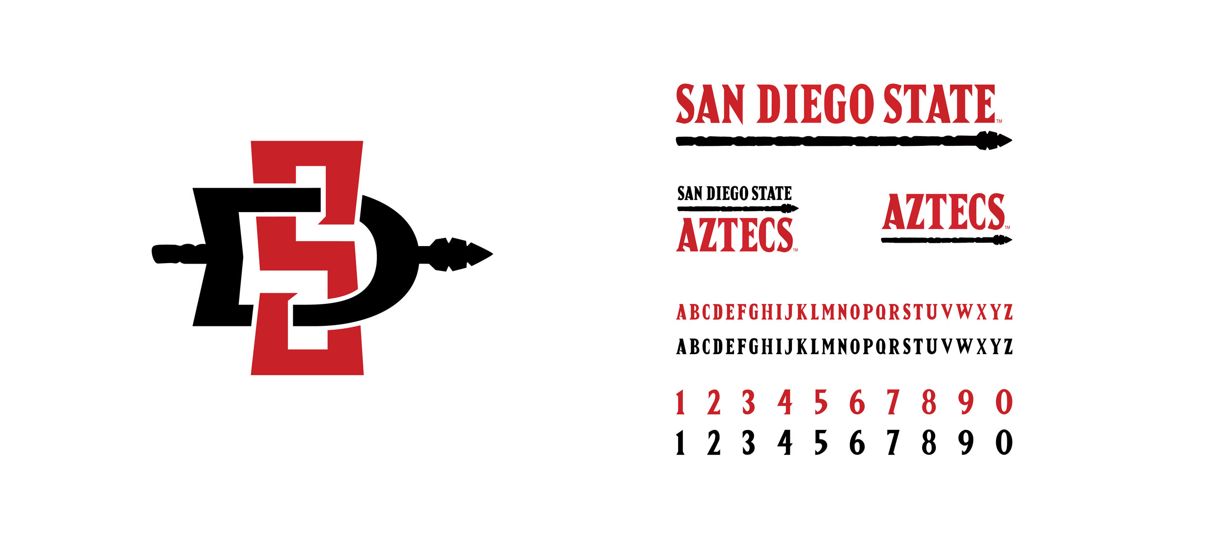
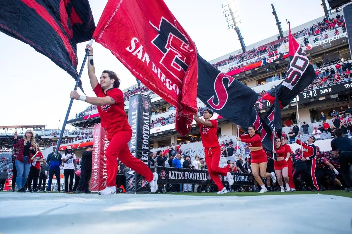
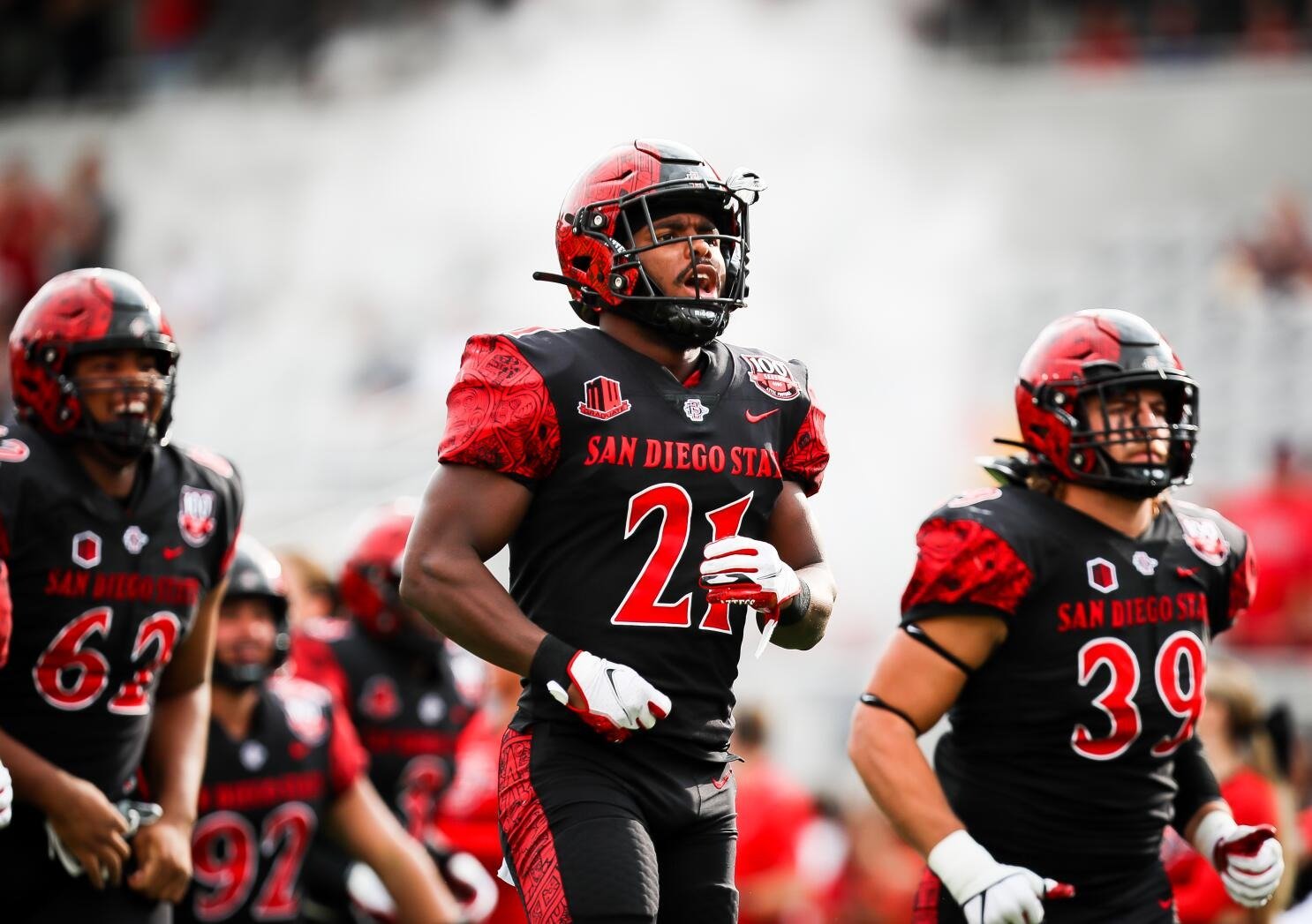
In 2002, OCG developed a logo system that built unity and spirit among the diverse sectors of SDSU Community. The logo needed to portray the strength and diversity of the SDSU community. In 2017, OCG was asked to create a more updated logo. We decided to give the logo a more streamlined and simplified look which is now featured throughout the SDSU Athletic Department.


The Results
SDSU wanted the new logo to portray the cultural significance of the name “Aztecs“. The Spear, utilized in both primary and secondary logos, was a favorite weapon of the Aztecs and was most commonly tipped with double edged obsidian points, and symbolized offensive strength and power.


“...Even though there were many stipulations that might have made the creative process difficult, Osaki Creative Group provided wonderful service, attention to detail and were greatly involved in the process from beginning to end.”
– Steve Schnall, Associate Athletic Director, SDSU